Introduction to Pixelart »
Over a number of years I have been steadily improving my pixel art skills from the early days back when I used to play around with RPG Maker 95. At the time I could barely manage making simple edits to tiny Final Fantasy styled sprites. Now, much later, it just doesn’t seem to be as tough as it used to be. In the early years my pixel art just did not work and looked generally awful. Despite being told by inexperienced viewers that the work was good, it simply wasn’t up to scratch. I couldn’t get the line work right, the shading right or just about anything right with it and without these basics being mastered, the more difficult stuff would never look high-quality. Only when the pixel tutorial site Spriteart.com came along were the basics understood. Once the basics had been learned, the rest just seemed to fall into place.
Spriteart.com no longer has its tutorials up, unless you go snooping around in the archives, so instead here is a tutorial for learning pixel art from the ground up. Firstly, the things that need to be taught, understood and mastered before anything else are the basics. The tutorials on the basics may seem familiar to some as I like to follow the lessons learned from spriteart’s fine examples. There are four basics: line art, colours, dithering and finally shading/anti-aliasing. Depending on your level of ability, you should try out practicing some of these basics to make sure you understand them.
Line-art »
Line art can be tricky for pixel art. It makes a whole lot of difference to a piece of work if the line art is solid. When it isn’t, the final piece is usually always a disaster. Nowadays, the line work is actually less vital than it was back in the 90s, because the resolution for games is so high currently that you would barely notice some slight problems. However, as far as this tutorial goes, it’s always best to teach the fundamentals correctly. There are five straight lines in pixel art. The 0, ¼ , ½ , ¾ and 1 of a right angle.
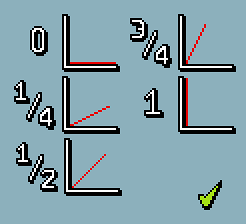
These five different straight lines can be mirrored or rotated, but what makes these lines better than others is that they are consistent. The pixels always work in ones, twos or are completely vertical or horizontal. This can also be done for any number, as long as they’re always consistent. These straight lines are particularly useful when it comes to isometric designs, like those in Sim City 2000. Using this type of line is not always possible, especially for non-uniform, organic shapes. However, by including them in as many places as possible makes a sprite look far more polished as a result.
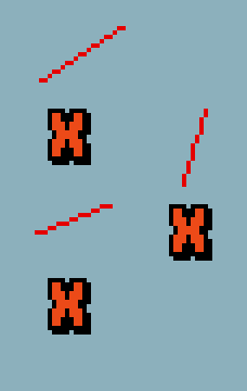
These are examples of straight lines to avoid wherever possible. When doing pixel art, you should steer clear of these types of lines as they appear wonky and shapeless. When seen at a lower resolution, which in the 90s they would have been, there were clear problems with this approach. Small problems with irregular lines can be hidden by using anti-aliasing, which will be addressed further down.
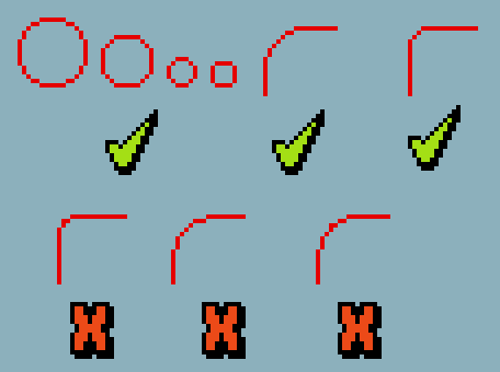
When doing a pixel piece, make sure that all curves are smooth and precise. Uneven and jagged corners, like shown in the three lower curves here never look good on a piece of pixel work. The examples provided include kinks and uneven placement of pixels that do not make curves look convincingly smooth. The example circles and curves shown above them are how best to approach curves of different sizes. When making a polished pixel piece, make sure than all of your line work is done by hand. You can rough out a sketchy design to start with, but go back over it and refine the design to make sure it adheres to these basic rules. I don’t care what anyone says, rules are not made to be broken.
Colours »
A mistake that occurs all too often with rookie pixel artists is that they never get their colours and shades right. Picking out the right colours and certainly the correct shades is hugely important to the success of a piece. There are two main areas that I think people tend to struggle with.
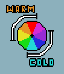
Firstly, people do not seem to take advantage of the colour wheel and the saturation (the strength of the colour). On the colour wheel, there are warm and cold colours. Oranges, reds and yellows are all warm, whereas blues, greens and purples are all cold colours. When creating shadow on a piece of work, it’s best to include more cold shades than warm shades. For areas that are catching the most light, it’s obviously better to include more warm colours. That’s why on plenty of professional pixel work, you will be them often using yellow for the bright spots and dark blue for the shadowy areas.
Many rookies tend to just pick a colour and then go straight up and down in brightness to simulate shading. When mixing two adjacent colours on the colour wheel together, you use the colours in between, when you do it with two opposite colours on the wheel; the mix you’ll get is grey. To steadily turn a warm colour into a cold colour, lower the saturation down to grey before moving into the blues.
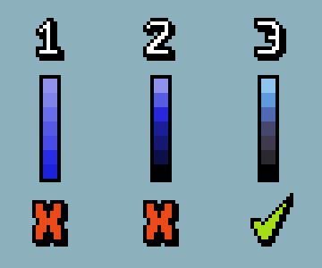
The second mistake they most inexperienced pixel artists make is that when they come to pick out their colours, they tend not to put nearly enough contrast between the shades they pick. For low resolution pixel art, the shades have to be instantly spottable from each other. In example #1, there are seven different shades included, yet it’s near impossible to identify between them, so make sure that you give a sufficient amount of brightness difference between each shade you pick.
Ideally on most pixel art sprites, you hardly need to go higher than five different shades per colour. Example #2 doesn’t take advantage of the tips given in the first part of this section. Example #3 is the best as it has the right amount of contrast between the shades and also has taken advantage of the amount of saturation and the colour wheel as well. At the brightest colour, it is a warmer colour and has more saturation. The darker shades are the complete opposite with less saturation and a colder variant of blue.
Dithering »
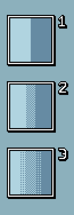
Dithering is the method of seemingly creating more blending shades out of a limited amount of colours. This is an old technique that doesn’t have much relevance these days, but I still find it useful for including when I don’t want to create another, completely unnecessary colour. It also has its uses for added a textured roughness to a piece that isn’t achievable with simple colour selection.
There are three stages of dithering. If you have two different shades or colours next to each other and you want to blend them together without creating an extra colour, the solution it to simple make a chequered pattern between the two with diagonal stripes on one shade over the other. This is a 50:50 between the two different colours as shown in example #2. The dithering effect used smoothes the transition between the two shades shown in example #1. To then go that bit further and make it appear smoother, the next step is to make the difference between them a ratio of 25:75 on one side of the chequered pattern and then on the other side of it, a ratio of 75:25. This is done by creating a series of uniformly displaced unconnected dots as shown in example #3.
Shading & Anti-aliasing »

One of the major crimes of shading pixel art is pillow shading, a poor replacement for anti-aliasing. Pillow shading is where a number of progressive shades just run parallel to the edge of a sprite. This approach to shading looks terrible whenever it is used, so it must be avoided at all times. Pillow shading can be seen in example #2 to the right. From the original, un-shaded curved edge, example #1, which uses proper anti-aliasing, shows how to smooth out sharp edges. The three shades that are used on the pillow shaded example are used to the desired effect here where even though they still run parallel to the edge, the difference is that the shades fade out appropriately. If you follow the approach shown in example #1 when it comes to anti-aliasing your pixel art pieces will look smoother and sleeker.
Spriting »
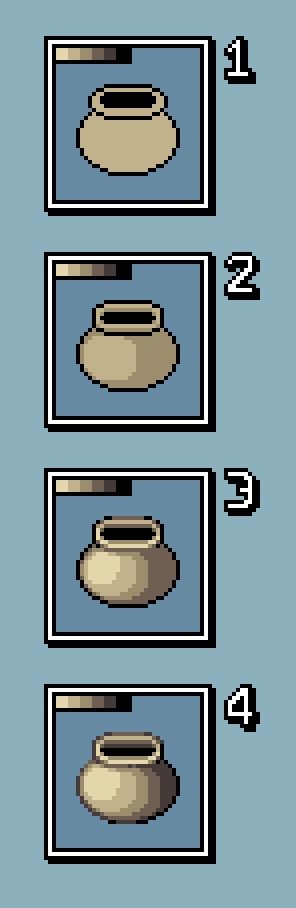
Now that we’ve gone through the basics required to model a simple sprite, it is time to put them to use. Here we will go through the straightforward approach to shading. A simple starting point is modelling a ceramic pot. Create your own pot sticking like glue to the basic fundamentals described above.
Example #1 includes creating a colour palette that takes full advantage of the colour wheel and the different levels in lighting and saturation. The colour palette that has been used in this sprite has sufficient contrast in it to make each different shade clearly identifiable from the other. In this example, the pot has been started with a simple flat picture and filled in with the second brightest colour. Where the black line art as been drawn out and cleaned up so that it works in the exact same way that was shown earlier. The whole pot uses curves, but for where there are long stretches in the same direction, it’s always done by using one of the five major lines shown in the line art section of this tutorial.
After this, in example #2 the first shade is added. This is the next shade down to the one already put on in the first step. Make sure that the shade follows the shape of the pot. In this case, the pot is rounded and warped outwards, so there would be shade at the bottom of the pot, just underneath the rim at the top and anywhere which isn’t facing directly at the light source. Make sure that the shading added also follows the basic principles of line art. On this pot sprite, the light source is coming from some area to the front left side of the pot. At this point start adding some of the anti-aliasing in where the current brightest area nears the edge of the sprite.
With example #3, the highlight shade is added onto the body in the middle of the current brightest areas. In this case, at the top of the rim and on the large patch on the left side of the main pot. Also, the next shade down is added to the far dark side of the pot. At this point the pot will be really starting to take shape if the anti-aliasing, line work and palette are good.
The final step with example #4 is to add the final shade to the object and then replace the black outline. Complete black outlines are best to be taken out, unless they’re kept in for a specific reason. However, do not scorn absolute black completely as it’s still useful for dark areas. However, in areas where the lighter shades are next to an edge, replace that edge with another dark shade on your palette. You can also anti-alias your edges, but try to keep them clear and darker than the main body. At this point take a good look at your sprite and consider what areas you do not like, or that do not stick to those basic principles and then go back to tweak them. I did the same when creating this pot various times just to get it absolutely how I wanted.
« Back to Tutorials