Pixelling A Monster Sprite »
This tutorial is aimed to guide you from having a limited understanding of pixel art through the several necessary stages on your way to creating a working, professional looking RPG styled monster sprite. These sprites may look difficult to do, but as long as you stick to the basics and make the monster bit by bit, it won’t too much of a chore. For this tutorial, I originally intended to make a slimy gastropod styled monster. By the end, the resulting creature has something similar to that of appearance, but some fleshy body had been added for the arms and head. Let us begin with the tutorial then.
Step 1 »
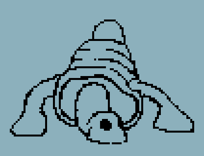
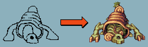
When creating a relatively large sized monster sprite, here being 94 by 72 pixels, it’s handy to sketch out a quick, unpolished design to make sure that you know what you’re drawing. Be sure to do this before you start a big project, otherwise it is certain that you will become stuck at some point, or find you’re not pleased with your original design later on. When sketching out a design, it helps to prepare you for what you want to see by the end. This design compared to the final result looks far less intricate and just coasts over the general shape. You can do this design sketch as a silhouette, but I prefer to use line work here. The problem, of course, is at this stage the line art is a complete mess. This will need to be cleaned up.
Step 2 »
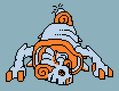
By following the line art principles, we can clean up all of those ragged sketchy lines and replace them with some far more polished. Take not at areas like the curly horns and the curving shell near the top. These are examples of smoothed curves shown in the introductory tutorial. At this stage, some of the extra detail was added to flesh out the creatures design, like the horns, the shape of the face, the arms, claws and most significantly, the neck. The shapes of the arms were created with bulges and muscular definition to make them seem more organic. Zoom in on these arms and familiarise yourself with how they are done. There is no direct way to teach this, as it’s down to an understanding of anatomy, but with low detail pixel work, it’s simple to just wing it and still end up with something arm like.
The three main muscle bulges you’ll be trying to emphasise are the shoulder, the bicep and tricep. Note how on the arms and hands, completely diagonal, horizontal and vertical lines were all used as often as possible. Dithering was also used to fade out the shell’s kinks. For my monster sprites, when doing the line art stage, I always use a light orange and blue colour scheme for the template colours as they are opposite colours on the colour wheel. They stand out clearly from each other and also the black outline.
Step 3 »
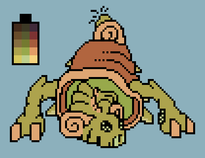
The third stage is to set up a colour palette. For this sprite I’ve chosen a selection of muted yellows, greens and browns. Very swampy, foresty colours, as that’s where I’d picture this monster to live. My approach to colour choosing is to picture an environment to go with the creature, so for sandy regions I’d pick browns, greys and yellows, for snowy regions white, blue and brown. In the tutorial on the pixel art basics, on spriting the ceramic pot, we first picked out the second brightest colours from the palette to be the base colours. The same is done here, so there are roughly three shades darker until absolute black and one shade brighter, the bright spots. Once you have a decent palette created, fill in the line art where appropriate, adding some helpful darker tones if you find it helps, like I have for the shell.
Step 4 »
With this next step, the next shade down for each of the colours is added to the relevant places. For the arms, this means on the underside of them and anywhere that is faces away from the light source (the front left). Also, shade is also added to areas that are blocked by other parts of the body, so the little spikes at the right side of the big shell and the body inside the shell itself are covered mostly in shadow. Where the lightest areas near and touch the edges of the design, make sure they you start anti-aliasing the shades at the boundaries.
Step 5 »
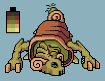
Adding a third shade really helps to make the design start to come to life. Here more shade is focused around shaping the face. The darkness comes just under the cheekbones, the mouth and anywhere shadowed by the horns. The horns are also given extra anti-aliased shading and the black outline swirled turned to a dark shade of brown. The extra shade for each colour is added all around the body making the shadows darker and giving the sprite more definition. Some dithering is added to the shell here as I picture the shell to be quite a rough texture. It also helps to add detail to the shell as it might otherwise seem a bit under detailed compared to the other areas. At the top of the sprite, some simple and very basic grass-like hair has been added.
Step 6 »
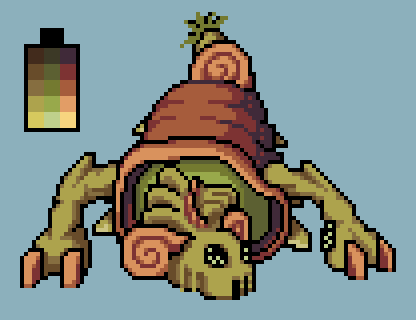
The sixth step is to add in the highlights. This is the next shade up on your palette from the starting colours you used. This is where the sprite starts to look good. The parts that catch the light provide perfect contrast to the darker areas. The sprite is now much more vivid and lively. The shell has more shape to it now and still includes the dithering to help give it a roughness. The outlines of the sprite are still left black for now, but with this stage, it’s definitely getting there. At this stage, some shading was also added to the bug-like eyes so that they appear less flat. Some light was added around the face where the skin would mostly be facing upwards, like just under the eyeball, and around what would be the nose/snout area and the forehead.
Step 7 »
In this penultimate step, the gooey membrane centre of the creature is filled in. This is done by simply taking the previous version of the creature and drawing lighter shaded veins over it. The whole area was darkened to fit in better with the rest of the creature. The shell and other areas were given a final tweak and extra shading just to finish off any areas that needed a little refinement.
Step 8 »
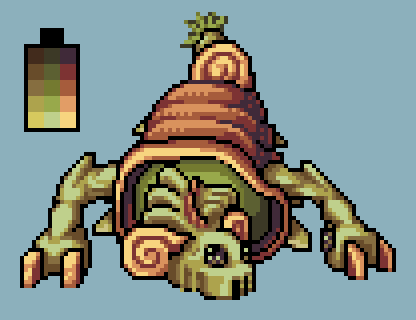
The final stage sees us replacing those black outlines were more suitable shades. I always prefer to keep my edges clearly visible by being a shade or two darker on the palette than adjacent pixels. In some cases these would be black, but in most they would be one of the darker shades. Go over the black outlines using anti-aliasing and replacement with what you consider to be the most appropriate shades from your palette. You should then end up with a result similar to that on the left! Good luck in your future pixelling.
« Back to Tutorials